In approaching property brandings at Compass, the designs lend to reflect the homes, surroundings, and architecture in order to help expedite the sale of the homes.
The direction for Brittlebush Ranch was inspired by the architecture of the properties and land surrounding Joshua Tree National Park. The type style and icon are a clean, chic representation of the fun vibes of the Joshua Tree and Palm Springs area.
You can see how well the logo plays off of the desert landscape and is a bit playful like the Joshua Trees themselves. The sunburst also showcases the beautiful sunny days, sunrises and sunsets you’ll find when visiting the area.
Strategy | Branding | Editorial Design
Brittlebush Ranch Property Branding

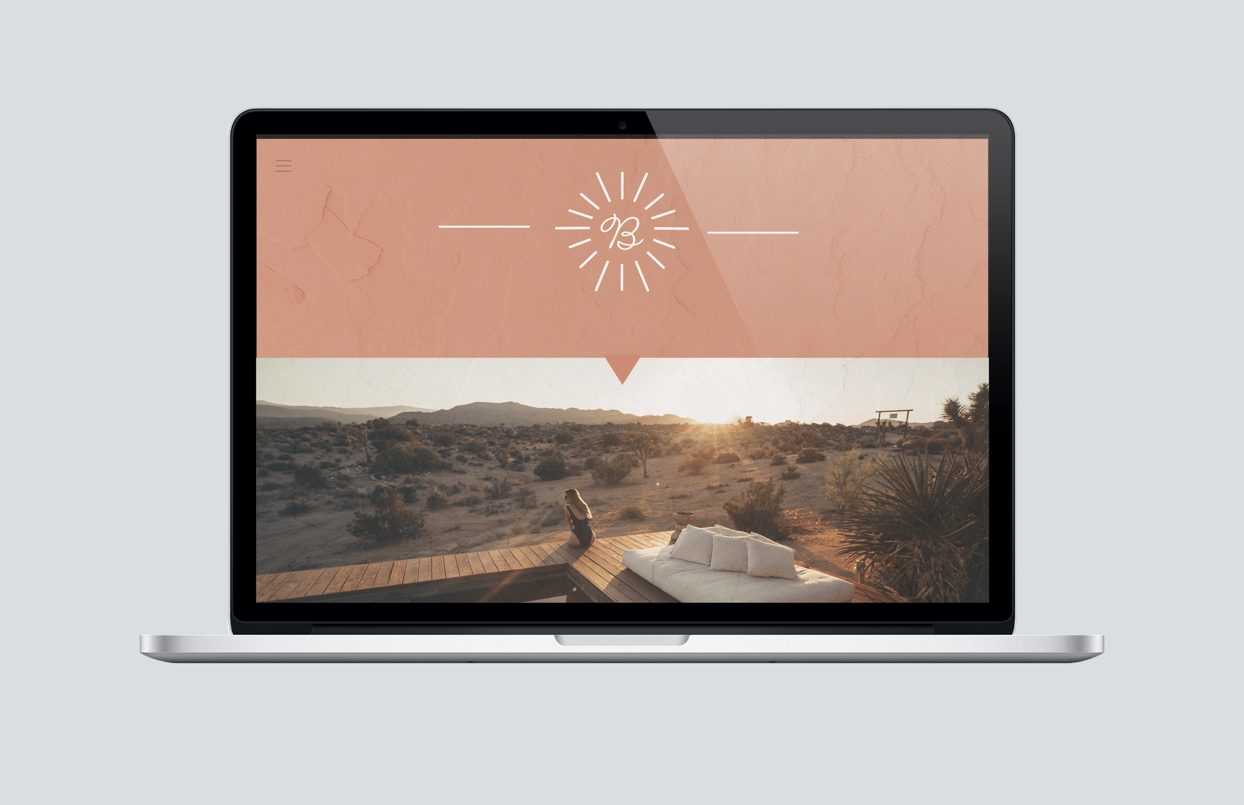
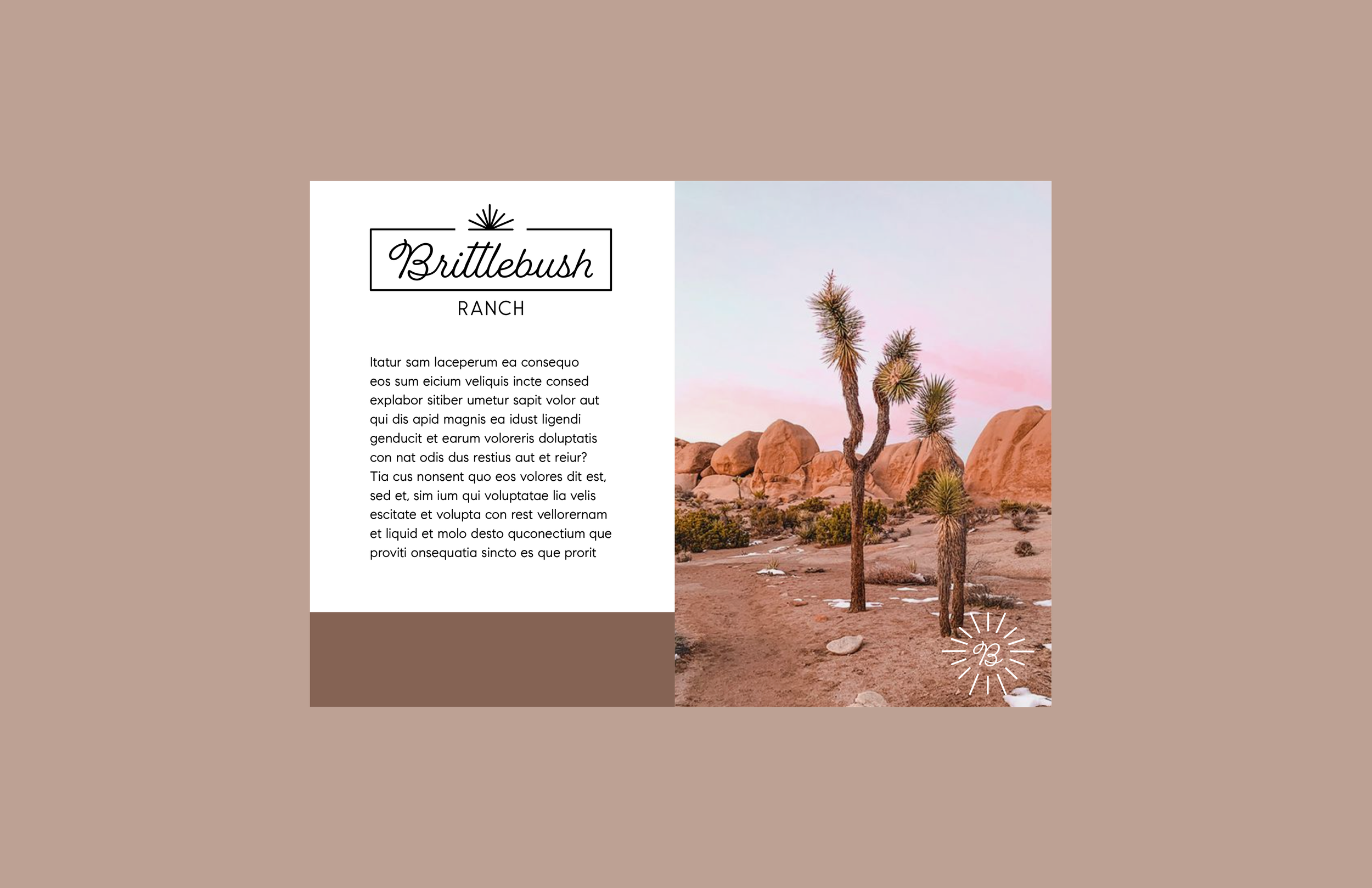
With introducing a soft color palette, we also introduce a secondary condensed logo option. A B within a sunburst. This could be an option to use on a smaller scale when the regular logo might be too complex.
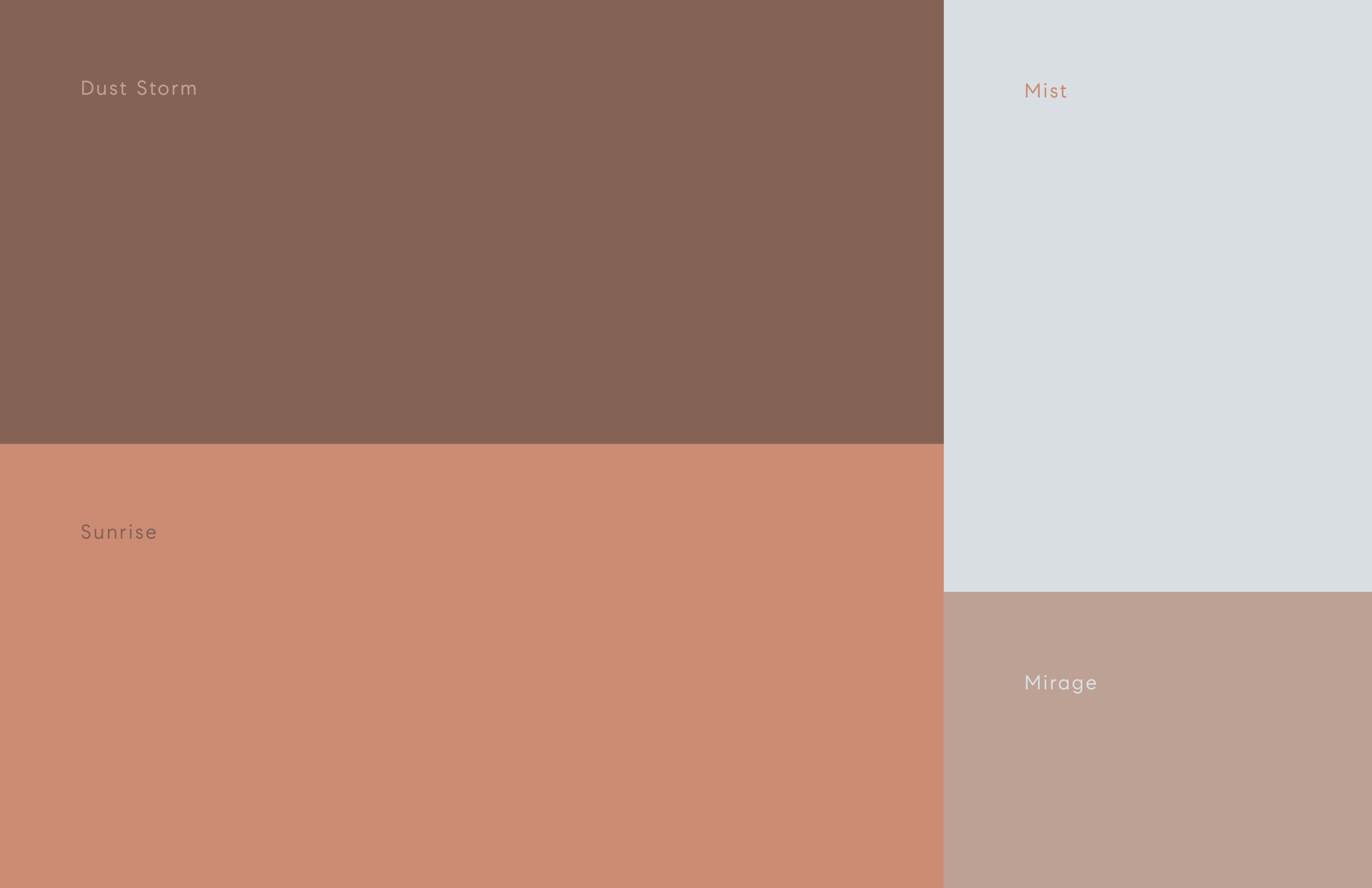
This color palette has soft, romantic hues you might find in the morning or evening skies of the desert. The names also reflect this with a dusty purple called dust storm, a peach called sunrise, a cool blue called mist, and a soft beige called mirage.
For the website, I wanted it to showcase some of the luxury you might find at the property by keeping it minimal and clean, with lux focused photography and natural textures.
For the postcard, you can see both logos in action, the secondary one adding a little decorative touch. The focus is still very much on the brand but supported by this beautiful color palette and supporting photos.
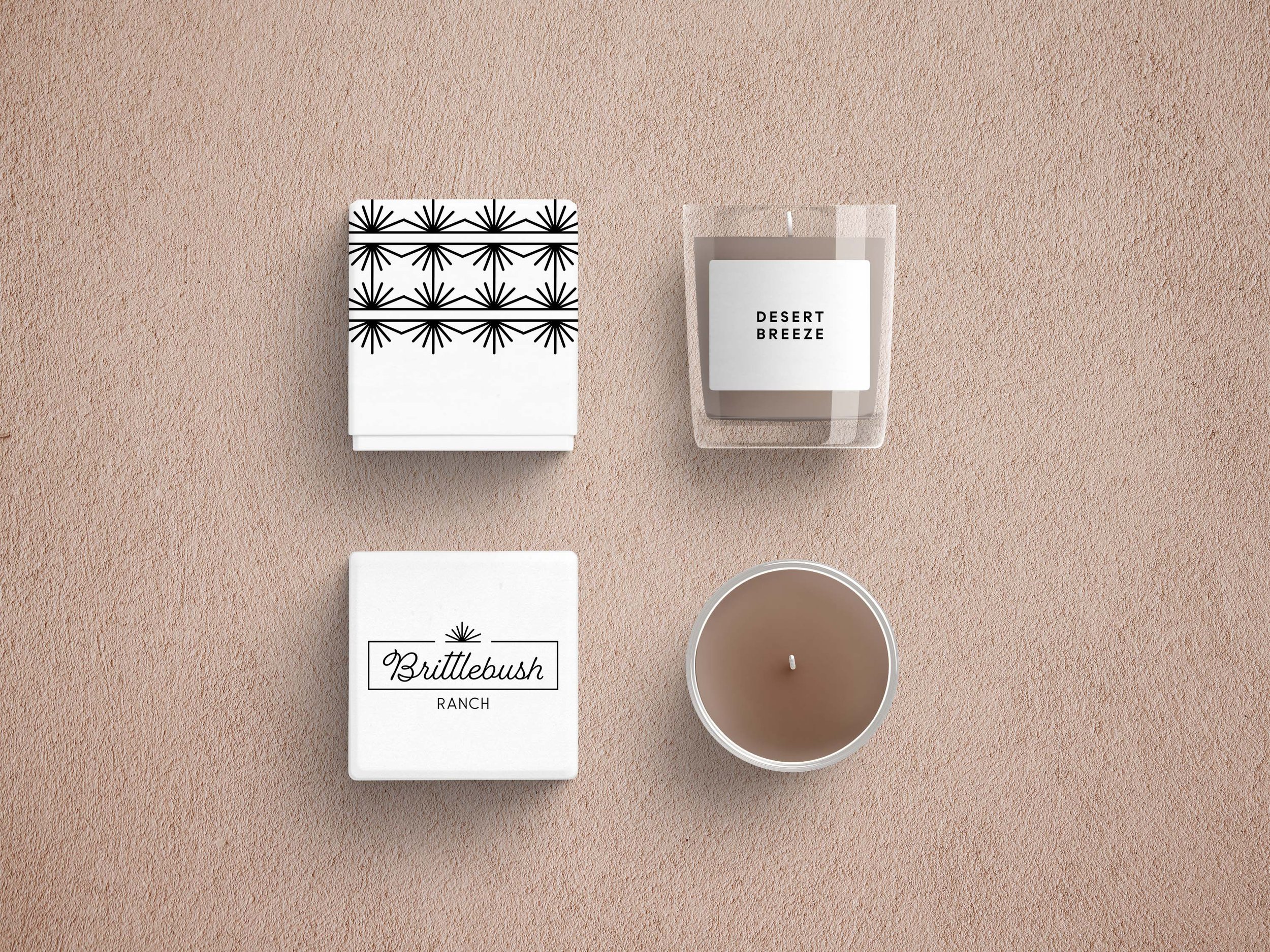
You can play with the logo sunburst to create some chic patterns on client gifts, like this gorgeous candle option below.
